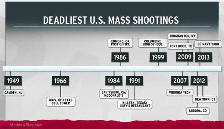
If you consider the deadliest mass shootings in American history -- at this point, shootings with 12 or more fatalities -- you'll find the first one happens in 1949. A deranged lone gunman's "Walk of Death" in Camden, New Jersey, claimed the lives of 13 people.
The next one happened in 1966, when a lone gunman climbed the bell tower at the University of Texas and began shooting. He killed 16 people. The first half of the list of these horrible shootings, as Rachel pointed out on the show last night, took place over half a century. The second half took place over just six years, from 2007 until yesterday.
Will Femia today made you another version of the timeline (thanks, Will!):
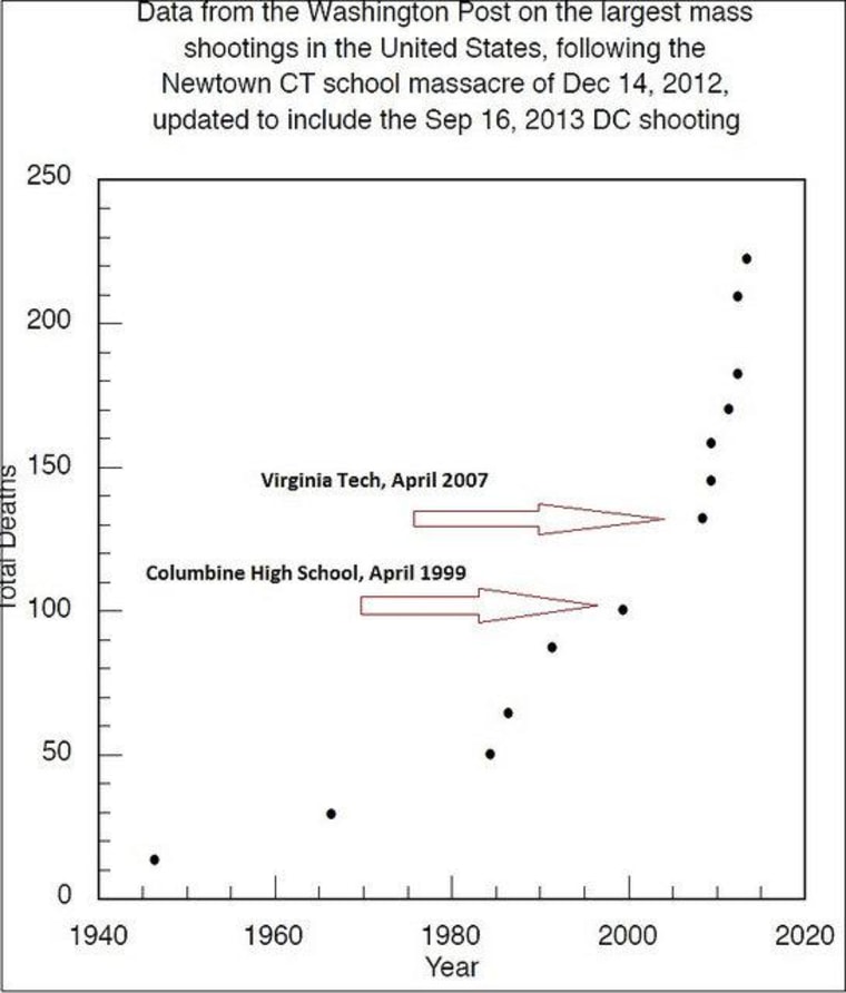
Big thanks also to Dr. Charles Catania, the professor at the University of Maryland who first pointed this out after the massacre at Newtown. Catania has another way of looking at the data, which is kind of a challenge, so I'll put it after the jump.
In this view of the deadliest mass killings, Catania has charted the cumulative effect of all those casualties. Through the massacre at Columbine High School in 1999, the toll stood at 100. Since then, starting with the massacre at Virginia Tech in 2007, the toll has more than doubled -- in just six years.

Note: Catania updated his chart from December, showing 12 massacres, with the Navy Yard shooting yesterday, so he's got 13 entries. You can find a bigger version on our Flickr page. You can send us stuff -- we love getting stuff -- here and here.
Below, the chart segment as it aired on TV:
