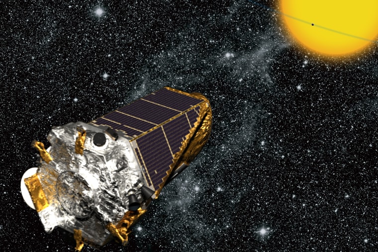
NASA's Kepler Mission is the gift that keeps on giving. The mission launched in 2009 and has found well over 1000 exoplanets (planets around stars other than our own) to date.
These planets come in all shapes and sizes and most have orbits drastically different from the planets in our Solar System. Many different artists and scientists have come up with ways to try and visualize all the planetary systems we've discovered to date, but as you might expect, it's quite a challenge to try and show thousands of planets orbiting hundreds of stars all in one graphic.
A few previous attempts worth exploring:
- This interactive from the New York Times in 2013 allows you to sort by size of orbits or year of discovery and displays each exoplanet as Earth, Neptune, or Jupiter sized.
- This artist's illustration from 2013 depicts every star with a planet Kepler found to date in size order and with accurate color. [The one star by itself is our Sun show with Jupiter transiting.]
- Astronomer Dan Fabrycky made this digital orrery (an orrery is basically a model solar system) of all the Kepler systems known as of November 2013. [Our Solar System is represented in the upper left for comparison.]
- Astronomer Alex Parker created this beautiful abstract looking image in 2014 overlaying the data for exoplanets using time versus distance (as in the planet's orbital period versus its orbital distance).
If those don't all blow your mind, try this on for size. The latest exoplanet visualization comes from graduate student, Ethan Krause, at the University of Washington. Ethan took a stab at visualizing all the Kepler planetary systems as an orrery (similar to Dan Fabycky above), but he added in color coding to show the approximate temperature of each planet (on a scale of Earth to lava). This time the Kepler systems are overplayed our Solar System for comparison - the inner planets are visible to the right and the orbits of the other planets cut successive arcs through the visualization to the left as the video zooms out and back in.
We're at 1,705 planets and counting, so stay tuned...
Here's some more geek from the week:
- The world's oldest bird is a 64 year old albatross and she is about to become a mother again.
- This gallery of fluid dynamics gifs is mesmerizing. Be sure to click through to the hummingbird one!
- The University of Maine is building a gigantic wave pool to help test ships in high seas.
- Our loud, abrupt alarm clocks are an artifact our past lifestyles.
- Just in time for the holiday cookie season, the science of why you should cream your butter and sugar.
- Swedish researchers have found a way to make a type of paper that stores energy.
- The New York Times has a photo blog for visualizing the effects of climate change and it's striking to say the least.
- The physics of the asteroid in Pixar's The Good Dinosaur.
- The Mos Espa spaceport set from Star Wars is slowly being reclaimed by the Sahara desert.
- The internet is a beautiful thing when it randomly gives you the original patent NASA filed for the Space Shuttle.
- The first British astronaut to go to the International Space Station will run the London marathon IN ORBIT.
- Amusing hypothetical report cards for famous mathematicians as children.
- ICYMI, the theory of general relativity just turned 100 years old. Watch this great explainer video narrated by David Tennant if you want to know what the fuss is all about.
Keep on geeking!
@Summer_Ash, In-house Astrophysicist
