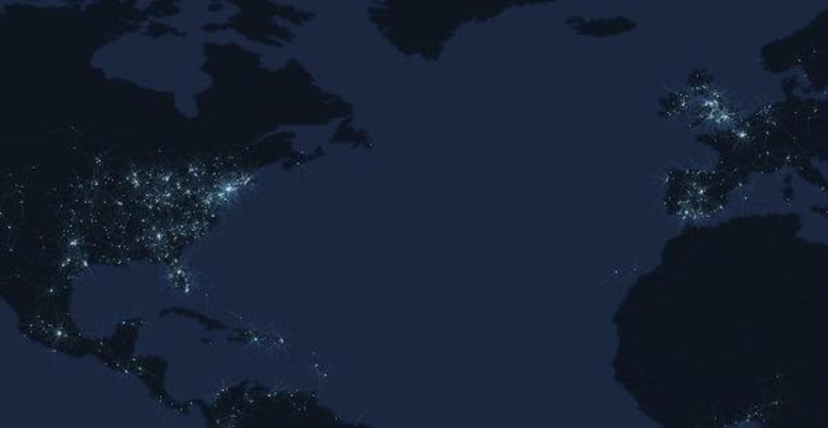
TweetPing says it's a real time map of Twitter activity around the world. I don't have any information to the contrary, and it comes with a dashboard that makes you feel like a boss surveilling the planet, so I'll take them at their word.
The data loads (or streams?) too quickly to be able to read much, so the real information is in the accumulated glow of global tweeting hotspots. Surprisingly, even at this hour the eastern half of the United States is blazing away.
But what else is hard not to notice is where there are no blinking lights of technochattiness.
Not to get all Libby Downer on an otherwise cool information display, but The Atlantic Cities has an interesting piece today on the internet reinforcing inequality through data maps. Unlike the hardware- or service-based digital divide that is usually the focus of technological inequality discussions, in this case the concern is that there are some places (actually, some people) who aren't generating local information at the rate of other places. In the spots on the TweetPing map where we see people tweeting, we can also imagine they're taking geotagged photos, writing Yelp reviews, logging traffic data with Waze, adding layer upon layer of data for their region. Some places -and I mean places where people really live, not just empty forests and farmland- don't have much or any of that.
Maybe you don't think this is necessarily a bad thing. Trees still make noise when they fall, even if no one has checked into the forest on Foursquare. Maybe the more valuable reminder is that while the internet with all of its data can often give the impression that we have the world at our finger tips, we're often looking through a lens of largely self-selected data, and we should be mindful of the composition of that lens.
