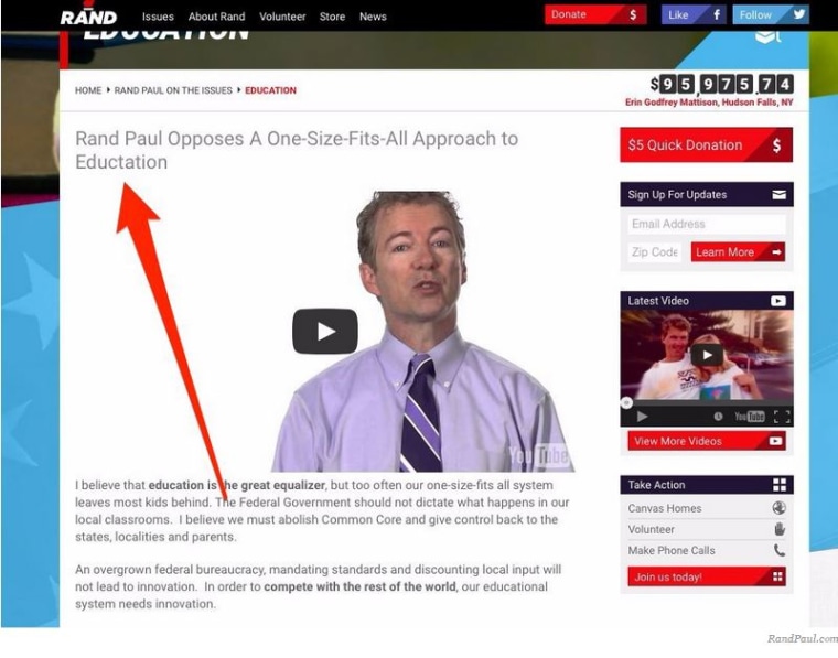
As Kentucky Sen. Rand Paul officially announced his presidential bid from Louisville, Kentucky, on Tuesday, his team of digital gurus were doing their part to launch an interactive and social-friendly site that would outshine his challengers and embrace all who #StandwithRand.
But their efforts came with a series of embarrassing mistakes that caught the attention of many on social media.
Leading up to Tuesday's rally, Paul's team put the finishing touches on the Rand Paul 2016 website, and launched it as planned. But one typo — in perhaps the worst spot — nearly spoiled it all.

The error was fixed while Paul was mid-speech, but not fast enough. Nothing goes unnoticed in the Twitosphere.
That was also the case for these pre-crafted icons, which the campaign helpfully suggested supporters use as their social media avatars.

The wording of one category, in particular, set those on Twitter into uproar:
The Rand 2016 campaign did change the graphic — with this fix: "JEWISH for RAND."
The flub also quickly cascaded into scrutiny over the types of supporters who were not offered pre-made icons.
Sure, the campaign expects Democrats, Catholics, African-Americans, and even fishermen will want to publicly declare their support for the senator. But, many questioned, where were the icons for Republicans, LGBT individuals, Latinos, or Muslims?