Dysfunction in Washington has reached new lows -- but now there's a fascinating way to visualize just how bad it's become.
In a new study of polarization in the Senate, Harvard computer science student Renzo Lucioni has created a model to graph the voting relationships of senators across party lines. What began as a senior class project has since made its way from the online depths of Reddit to publication in the latest issue of The Economist.
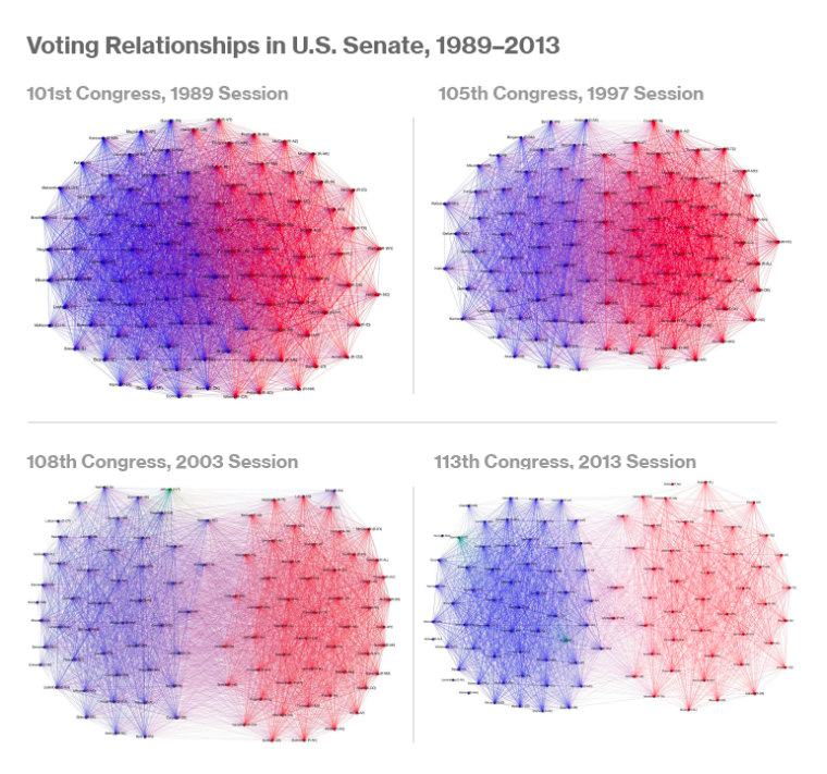
Using data from every vote of every senator from each session of Congress since 1989, Lucioni used red and blue dots to represent Republican and Democratic senators, respectively. The connecting lines denote the instances when one senator has voted with another, and the model graphs those with most votes across party lines closest to the middle. The more overlap you see in the graph, the greater the bipartisanship in that particular session of Congress.
If you fast-forward through the years, you’ll see the dots gradually retreat behind their respective party lines: it evolves from a tightly knit sphere to two distinctive clusters. The increasing trend toward polarization becomes most apparent over the last decade, from 2003, through President Obama's administration, to the present. The 113th Congress appears as one might expect: split down the middle.
The Economist described the visuals with a more colorful analogy: "Though America's political polarization has become a fact of life, it has never been seen so graphically: as a diseased brain, with few neural pathways between the two hemispheres."
Still, Lucioni warned against over-interpreting the results. “Be careful not to read into it too much, it shows that senators are working across the aisle less, but it doesn’t measure their ideological ‘placement’ – it’s missing an absolute center," he said.
The response has surprised him. “My intent was only to share it on Reddit," he said, adding, “government is an interesting space to apply these methods. It’s not commonly done.”

Image courtesy Renzo Lucioni.