If recent history is any guide, Republicans will probably start complaining about the Bureau of Labor Statistics sample size any minute now, complaining it's "skewed."
The new jobs report released this morning was largely in line with expectations, showing a U.S. economy that added 114,000 jobs in September. For a change, there was no gap in the public vs. private sectors -- American businesses added 104,000 jobs last month, while the government also added 10,000 jobs. [corrected]
Given the severity of the Great Recession that began in late 2007, and the losses associated with the years-long jobs crisis, no one should pop any champagne over 114,000 new jobs. That's only slightly more than the nation needs to keep up with population growth, and a healthier recovery would see numbers at least twice as high.
The reason, however, that the new report is encouraging is the larger context: the unemployment rate dipped to 7.8%, which is nearly a four-year low, and the revisions found 86,000 additional, unreported jobs from the last two years.
And while drops in the unemployment rate are sometimes the result of Americans leaving the workforce, that's not the case in this new report -- the employment-to-population ratio went up, not down.
By most measures, this can fairly be described as a strong jobs report, at least relative to where we've been.
For context, I'd note that so far in 2012, the economy has created over 1.3 million jobs over, which isn't even close to being good enough, but the total is already better than five of the eight years of the Bush/Cheney era.
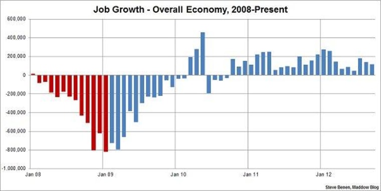
Above you'll find the chart I run on the first Friday of every month, showing monthly job losses since the start of the Great Recession. The image makes a distinction -- red columns point to monthly job totals under the Bush administration, while blue columns point to job totals under the Obama administration.
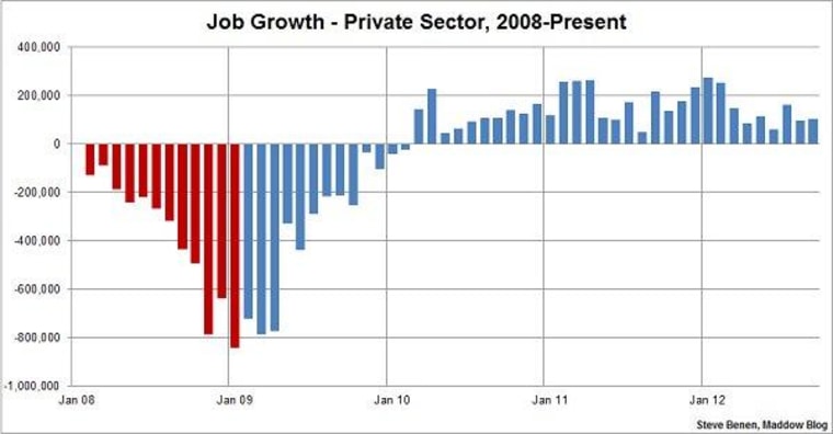
Update: Here's another chart, this one showing monthly job losses/gains in just the private sector since the start of the Great Recession.

