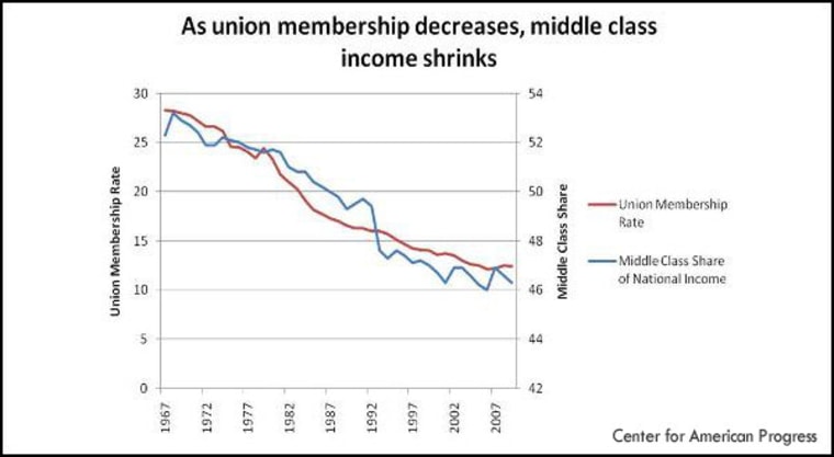
The most asked about graphic element from last night's show was the chart shown in Rachel's introduction to her interview with Barbara Ehrenreich, showing the relationship between union membership and the middle class share of income in America.
The source of the chart is this report from the Center for American Progress, published just as this year's new union membership numbers were released by the Bureau of Labor Statistics. If you dig around in there you can find some other interesting presentations of the data.
What the chart makes me wonder is if the middle class share of income is shrinking, how is everyone else's share changing? That answer is a little harder to excavate because while the data surely exists, and there are a lot of informative reviews of that data, it mostly focuses on the gap between the top 1% and everyone else. I'm sure the graph is out there though. Let me know if you run into something that shows how the share of income for other classes grew at the expense of the middle class.
(Related: While poking around I came upon this rich interactive from the NYTimes on income mobility. Lots to digest here.)
