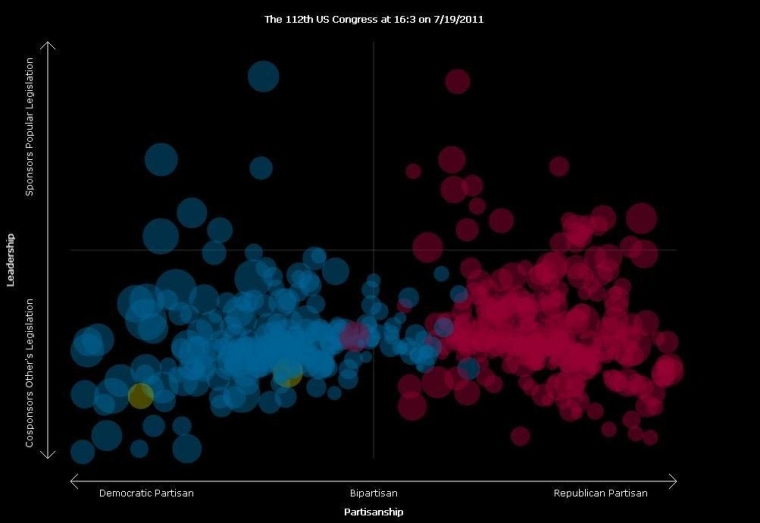
If you're the kind of person who loves info-rich, graphical representations of massive quantities of information, take a look at this. The Clear Congress Project, created by Thomas Gibes as part of his master's thesis project at Georgia Tech, charts the partisanship of members of the U.S. Senate and the House of Representatives in relation to their degree of leadership. (NOTE: It takes a few minutes to fire up as it calls up the database.)
The 3-part formula works like this:
Legislator’s Leadership Score = (# of cosponsors a legislator’s sponsored bills attracts) – (# of times a legislator cosponsors another legislator’s bills)Legislator’s Partisanship Score = (Partisanship score ofsponsored bills) + (Partisanship score of cosponsored bills)Bill Partisanship Score = (# of Republican cosponsors – # of Democratic cosponsors)
Is your head spinning yet? Click on the circle that represents a member of Congress and you'll see their latest tweet and/or news headline as well as a series of lines that link them to other members who have co-sponsored their bills.
"...if a legislator draws more cosponsors with their legislation, they move up the leadership axis. If a legislator cosponsors other legislator’s bills they move down.""And legislators who sponsor and cosponsor bills with cosponsors of the same party are placed at the ends of the partisanship axis (Democrats to the left, Republicans to the right), and those who sponsor and cosponsor legislation that contains cosponsors from both parties move towards the middle."
Another cool thing: the chart is constantly updated, so you can even track movement over the course of a legislative day.
(h/t Sunlight Foundation via The Atlantic)
