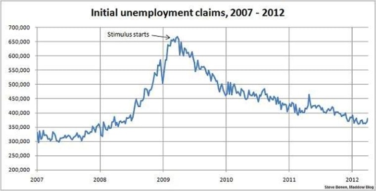
While the general trend on initial unemployment claims over the last few months has been largely encouraging, there have been occasional setbacks. Today's new report is the most discouraging in a while.
Indeed, while last week's initial estimate was the best report in four years, the new figures are some of the worst of the year to date.
The number of Americans who filed requests for jobless benefits jumped by 13,000 last week to 380,000, the highest level since late January, the U.S. Labor Department said Thursday. Much of the increase in the week ended April 7 was related to spring break, when many school bus drivers and cafeteria workers are allowed to file claims. Claims from two weeks ago, however, were revised up to 367,000 from 357,000, an unusually sharp adjustment. Economists surveyed by MarketWatch had projected claims would total a seasonally adjusted 359,000.The average of new claims over the past four weeks, meanwhile, rose by a smaller 4,250 to 368,500, the highest level in a month. The monthly average is seen as a more accurate gauge of labor-market trends because it reduces seasonal volatility in the weekly data.
In terms of metrics, when jobless claims fall below the 400,000 threshold, it's considered evidence of an improving jobs landscape, and when the number drops below 370,000, it suggests jobs are actually being created rather quickly. The new figure of 380,000, though skewed a bit by temporary spring-break-related shifts, is the highest since January.
And with that, here's the chart -- which reflects the revised, seasonably-adjusted data -- showing weekly, initial unemployment claims going back to the beginning of 2007. (Remember, unlike the monthly jobs chart, a lower number is good news.) For context, I've added an arrow to show the point at which President Obama's Recovery Act began spending money.
