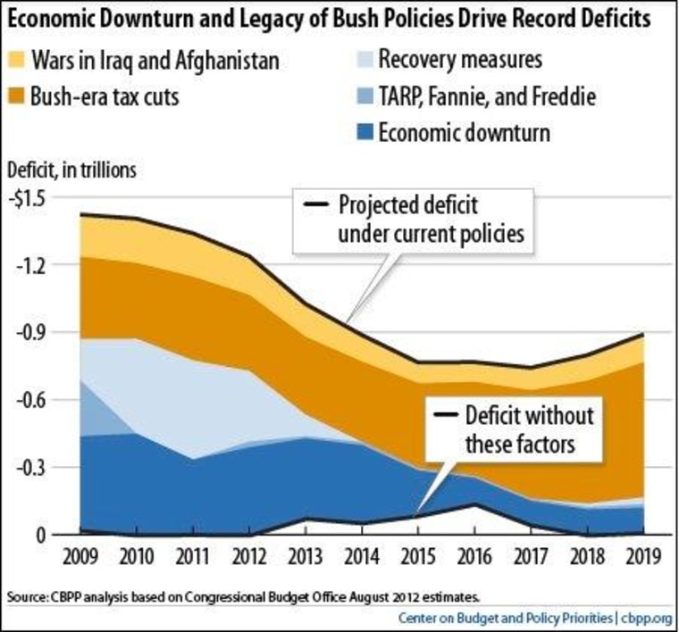
If you find yourself home for the holidays and arguing about the fiscal cliff, try these two charts. First, the Center on Budget and Policy Priorities shows how we got all this red ink. Simply, the Bush tax cuts did it. Letting go of the tax cuts for the rich would save $950 billion in deficits over the next decade, the Center says. It's worth reading their whole post.
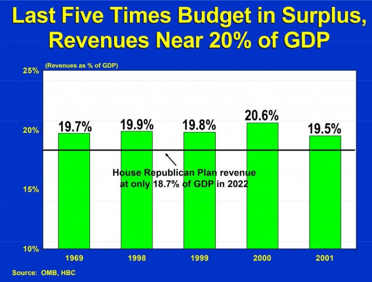
The chart below comes from North Dakota Senator Kent Conrad, a Democrat. First posted by our pal Ezra Klein, it shows the level of tax revenue during the last five budget surpluses. We're five percentage points, give or take, below that now, and we're broke.

