As the pinwheel of of snow accumulation forecast maps in my Tweetdeck scroll gives way today to hazy photos of snow-clogged traffic arteries, one term keeps popping up: bombogenesis.
Bombogenesis, as even the briefest of Google searching will tell you, is an informal-but-well-established meteorological term for a storm ("a bomb," in the vernacular) generating strength over water where cold air and warm air collide. The strengthening is characterized by a rapid, extreme drop in barometric pressure: 24 millibars in 24 hours.

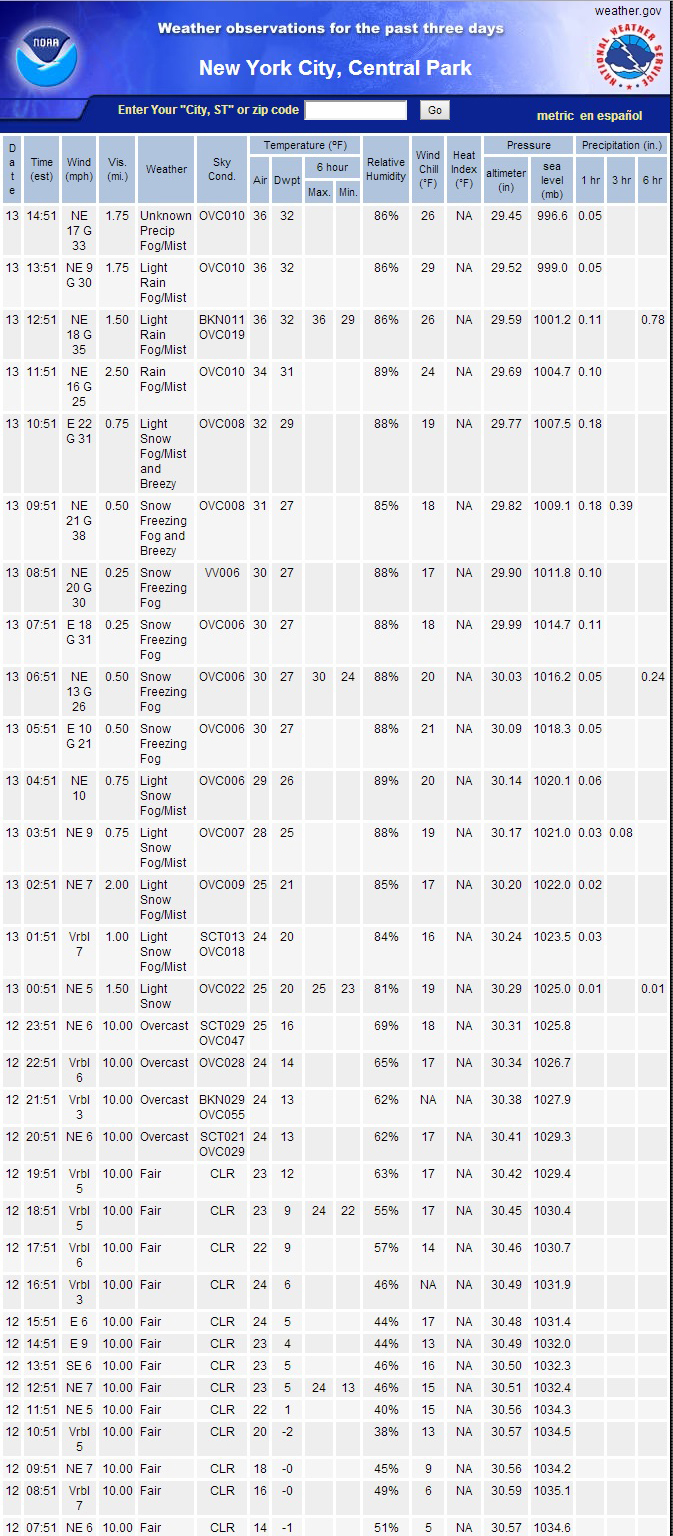
OK, giant Ls representing low pressure spots on weather maps are a familiar feature on every TV weather report, but how can we see the rate of deepening of that low to see that we are indeed in the midst of generating a bombo-? As it happens, I recently downloaded a barometer app to my phone, and it archives up to 48 hours of readings at up to an hourly rate. These aren't official NWS barometric pressure numbers (those are here, with this being the time frame we're talking about), but they're close and it's easier to see the phenomenon charted than in a list.
So here it is charted:

The tall image is from around 2 p.m. ET today and the pressure drop we're talking about is seen in the progressive shortening of the columns to the right. Those columns are roughly hourly measurements. The outtake images on the right show that in not even 24 hours, New York City has seen a pressure drop well exceeding the requirement to qualify for bombogenesis.
Bombo!
*Something to add or correct? Please do! Also, in case you're wondering, I use a Galaxy S4 Android phone, and the app is just called Barometer & Altimeter by Alessandro Rosso, the free, ad supported version.